Thursday 7 March 2013

Zine Research

In order to get a some inspiration for creating my own zine I did some research, looking at the layout and the way it is presented. 


I particularly like the way this illustration of a school bag has been edited using photoshop, as the colour goes out from the outlines of the sketch.  I would like to use this technique when adding colour to my sketches.


I like these sketches as they are very simple yet effective and work well against the plan white background. I would like to include some fine liner sketches within my own zine, maybe of the people interacting around castle markets.


Feedback From The Target Audience

This email was sent from a class of year 1 students who gave me feedback on my final pop up book. They found it very interactive and enjoyed the characters which I designed. The would like me to send them the original book so they can experience the full aspect of this book. 

Hi Tom have shown your pictures of the pop up book to the Headteacher, Geography co-ordinator and two classes of  5 and 6 year olds!
Many positive comments including "Has he thought of publishing this book and using it in schools?"
The children were very keen to see the original book so I have promised them that you will come in and show them!
Some of the comments were as follows;
" I think the book is suitable for children over 3."
" It will help people to learn about the different landmarks in each city."
" It would be a fun book to have in school."
" It was interesting to look at."
" I thought it was lovely."
" It was colourful."
" I liked the Aborigional painting that Tommy did."
" I recognised London Bridge."
" I sae the Statue of Liberty."
" I saw the 'Gherkin' and I've been inside it too!"
" Can we have some other countries and cities like Blackpool (!), Russia, Wales, Scotland, Spain etc."
The children suggested that you did another book about Great Britain and they thought you could add more information about each buiding and landmarks!
If it was to be sold they thought £20 to £25 was reasonable and some thought as much as £60 because of all the hard work that you have put into it!
They liked the fact that it was real characters so they may want to meet Tommy, Haydn, Gaz, Alex and Mark!
One little boy from my class was so inspired that when he changed his reading book he picked one about 'All round the city' and said he wanted to find
out more!
Thanks for sharing this wonderful resource with us.


Monday 4 March 2013

Final Pop Up Book

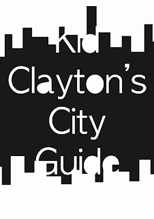
KID CLAYTON'S CITY GUIDE


Final Front & Back Cover

After receiving feedback from my initial ideas, I had a clear idea of how I wanted my final front and back cover to look like. I ended up following the feedback and created the front and back cover to look similar to each other. I added the diagonal writing to the front cover and outlined the text to make it stand out more. As well I added a speech bubble coming from the statue of Liberty with the blurb which creates a childish cartoon effect. 


Development Cover Ideas

I produced a few ideas for the front and back cover on photoshop and sent them off to a group of my target audience who gave me feedback on them. I found this helped greatly as they were able to tell me which they believed was more suited to my target audience. As well as pointing out parts which could be improved within the layout.

The feedback given back to me was that they didn't particularly like 1,2,3 as they didn't believe it was in keeping with the childish nature that the rest of the book portrays. 
However they particularly liked 4,5 as they could see some of my illustrations that come through the text. As well they thought the diagonal writing across the page was "Cool" as it shows random words which describe me as a designer as well as include the title which stands out using a bold red colour. 

Overall they believed that number 4 should be further added to, by using the diagonal random text in the background as it will be the same as the back cover. Were as number 5 should be the back cover and include the blurb/more relevant information. This is so the reader will be able to see what the book is about.  

1.

2.

3.

4.

5.


Front & Back Covers Ideas

As an experiment I tried to quickly come up with a front cover using my characters and make a catchy name 'The Teenagers Troublesome Travels' . Yes! it does keep to the illustration and child like nature with the rest of the book, however I don't particularly like the title or the grid layout. Probably because it isn't Artsy Fartsy enough!! 


So now that I have finished the interior for the book, I now need to create the books front and back cover. This is something that must still be in keeping with the illustration inside of the book, as well as being interesting to entice the reader.
I have come up with a few title names which use my logo name, so the reader will know who the author is. I particularly like "Kid Clayton's City Guide" - this is because it reminds me of a travellers guide and will teach the readers about the geography of each city. 


I have decided on the "Kid Clayton's City Guide" name, so I then tried a few sketches working out the layout of the front and back. I found this difficult at first as I needed the page to keep to the targets audience age range. But I will try a few experimentations using photoshop to create an interesting front and back cover.


Final City Pages

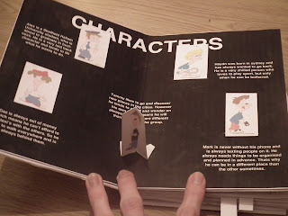
After a long time developing the idea, I have finally finished each individual page. These pages have a different city on it and have my own illustrations of the monuments found in these cities, as well as the characters being hidden somewhere within. I have added a small story of what has happened within each page, this is so the readers will be interested and want to find the character that is lost. As well I have added a 'Characters' page which shows a picture of them and gives a brief description of who they are. This is so the audience can read it and become more interacted with the book, as they may have a favourite? 
I am very pleased with each final page as it shows a variation of areas which I enjoy about design such as: Illustration, Character creating and 3D paper engineering. 

Characters


1) Sheffield


2) London


3) Paris


4) New York


5) Sydney


First Attempt

This was my first attempt at producing the London page for the pop up book. I really like how this page has come together will all the pop up elements working in sync with each other. 
However I feel that the 'Big Ben' pop up does not work well as the fold covers the illustration. As well I want the characters to be hidden better to make it more challenging for the reader. But all together I feel it was a good attempt and will continue to finish each page to high and professional finish. 


Cities Cartoon Monuments

I first sketched out in my sketchbook cartoon versions to each of the cities famous monuments. I then scanned them into illustrator to add colour and any other detail which would make the drawings more cartoon like. I particularly like to use illustrator and create new cartoon drawings. 

For each cities I did a few illustrations these are:

1) Sheffield 
- Hallam Hubs
- Winter Garens
- Hallam University 


2) London
- London Bridge
- Gherkin
- Big Ben 


3) Paris
- Notre Dame 
- Arc De Triomphe
- Eiffel Tower 


4) New York
- Statue Of Liberty 
- New York Skyline
- Empire State Building


5) Sydney
- Sydney Opera House
- Harbour Bridge
- Ayers Rock